Penguin Classics
starting over
Redesigns of two penguin classic editions, Fahrenheit 451 written by Ray Bradbury and Moby-Dick written by Herman Melville.
These were completed as part of a class project in Spring 2018 at the University of Minnesota - Twin Cities, there is no official affiliation to Penguin Books.
FAHRENHEIT 451
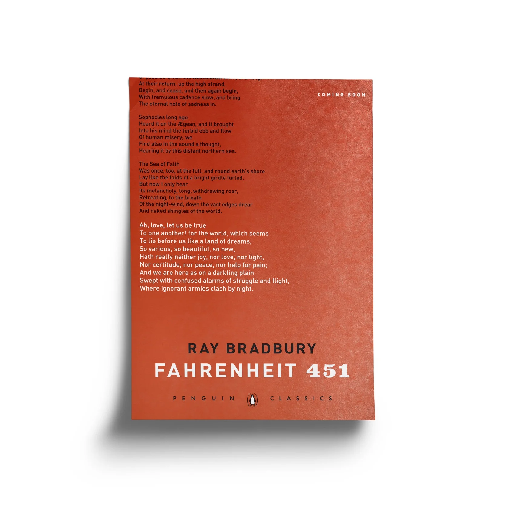
Fahrenheit 451 Written by Ray Bradbury centers around the journey of Guy Montag a fireman in a world where firemen work to set fires to censor books. Heavily focused on the symbols of ash, blood, and inspiration from the poem Dover Beach written by Matthew Arnold. These are represented in the designs by the blood, sand, and ash motifs used throughout the designs. An excerpt from the poem Dover Beach can be found on the poster design with the passage most important to the novel highlighted in white text. For the book mark I chose a quote from the book that played the best with the design choices I had previously made while also being important to the context of the novel. The scope of this project was to create an exterior cover and a marketing campaign for the novel, no work on the interior of the book was done.
promotional poster
bookmark
Moby-dick
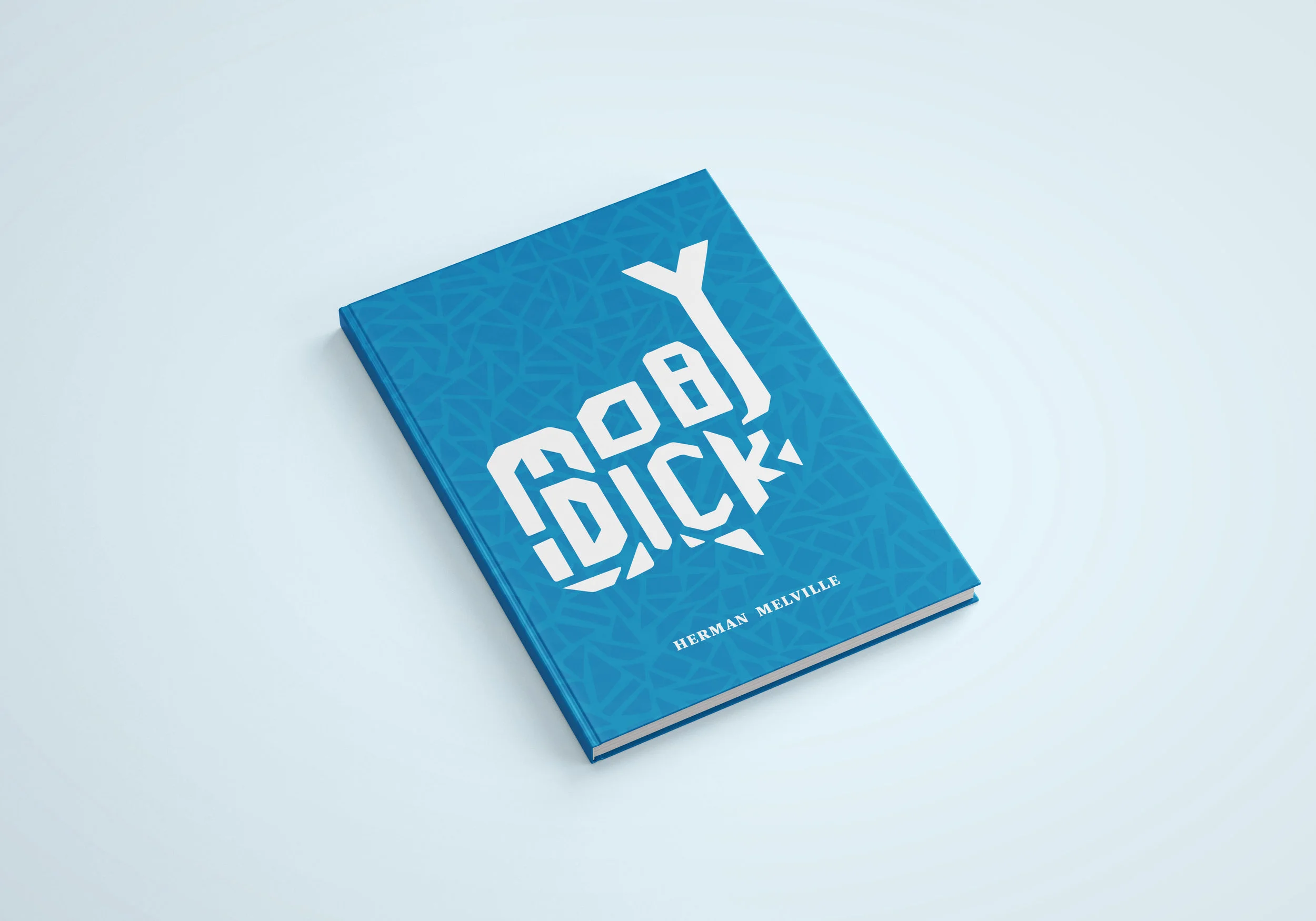
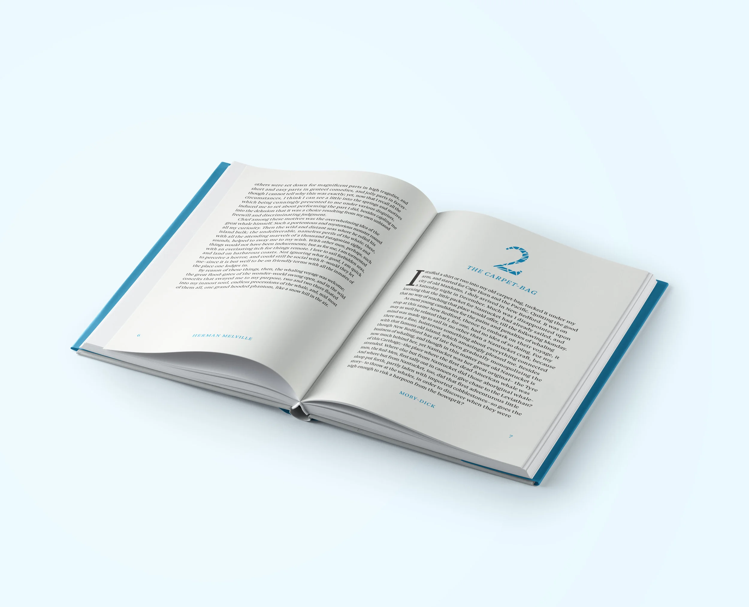
Moby Dick written by Herman Melville centers around the story of Ishmael as a narrator. However, I found more inspiration from one of the more important side characters; Queequeg. He acts as a cornerstone of the novel, representing the characters’ will to live through the journey. He is described as a heavily tattooed man with complex geometric patterning which I took inspiration from for the majority of the design work. The focus of this project was to create an exterior and work to create a balanced readable interior as a typography exercise.


